that predominate in 2025")
It's not about being radical (well, a little yes)
Offer experiences really attractive, useful and adapted to expectations of users is the soul of web design. All this, in a not overloaded way, but that impacts, also for its originality. And if the style of your website does not follow these guidelines, you will probably be missing opportunities to stand out in the market.
We must not forget that digital trends are fickle by nature, and a website that was perfectly valid three years ago may now have become obsolete - at least, in terms of design. And the consequence of this is losing visits and increasing the abandonment rate. AND we don't want that.
For all of the above, and as web design specialistsIn this post we are going to show you the 10 most daring web design trends for this year 2025. Did you know, for example, that the so-called brutalist typography prevails, with large, extremely expressive and almost tangible texts? We tell you everything in case you dare to be a little more “radical” in your online presence.
Table of Contents
Trends in web design 2025: the 10 most groundbreaking
Warning! Everything you are going to read below cannot be implemented at the same time, it would be crazy and nonsense.
Because? Because this selection of trends in web design that we have made is not based on generalities or on a sum of factors to be applied as a check list, but rather we have chosen to expose the most differentiated and with more personality, the ones that capture the most attention and connect. In other words, those that will differentiate you from your competition.. And some are incompatible. Therefore, you can choose several, but not all.
1. Vibrant and optimistic colors
One of the trends lies in using the so-called dopamine colors, which are the opposite of muted or neutral palettes. We talk about tones like Neon pink, electric blue, lime green, bright yellow and purple. This type of colors transmit vitality, optimism, joy, and well used can make a web page very attractive.
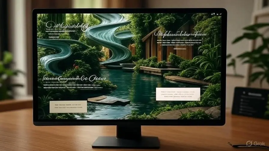
2. Elegant nature
We change totally third (proof of the incompatibility we pointed out before). We are going to Earth tones, minimalism, authenticity. Colors that remind nature -for example, wood or clay -and that are warm and create an atmosphere of tranquility -intense or blue sky. Can you imagine this combined with elegant or even manuscript? It is the perfect mix.
3. Almost tangible textures
We are in Amesb. The web It seems that it comes out of the screen, that its elements (texts, images) can be touched as if they were physical objects. The goal is to achieve a sensation of depth and volume that impresses. You can even incorporate 3D elements. Here, in short, the key is creativity.
4. Brutalist typography
Previously mentioned, this type of maximalist typography is one of the big trends in web design. Is raw, direct, stripped of ornaments and, above all, XL in size. With this technique, visual strength is prioritized, with great weight of typography over the rest of the elements, with contrast. But of course it is only intended for titles, not general texts. Including these headlines create a strong impression on the user's mind.
5. Basic and clean geometry
Repetitive geometric patterns, for apparent simplicity. Use of triangles, circles, squares, straight lines… A flow of shapes that reflect, at their core, a harmony and a deeply professional design. These basic shapes must be organize rhythmically on funds or sections, to generate modernity but with a background of order.
6. Not just photos
The graphic elements as vectors and illustrations They also generate impact. Its freshness, unlike generic resources, stands out and communicates personality. And if it is an artisanal illustration or adapted to the brand much better. As added value, if used as focal points or to separate sections, attract attention while facilitating the understanding of content, improving the famous user experience.
7. A different navigation
Experimental navigation is another innovative trend that seeks to surprise and "hook" visitors through more interactive experiences (compared to the traditional format of static or drop -down menus). It is important, however, to always ensure usability: that navigation is easy to understand so as not to frustrate users or affect functionality.
We have three tendencies of our selection, but here we must make a break. Because this article is probably interested, or it is looking curious, but Maybe you ask how all this is done, how to put it into practice and apply it to your website. Can Call us To tell us what you have in mind and We will transform your website.
8. Animations and soft transitions
We continue, now focusing on subtle and natural graphic movements, which move away from fast or overly flashy animations that can distract or saturate. This type of fluid animations improve aesthetics and guide navigation, such as smooth image fades or seamless transitions between sections.
9. Layering
Overlaying texts, images, graphics and colors on different layers provides depth and dimensionality to a web page. By applying overlapping layers, a rich, immersive visual effect is generated. Likewise, this technique makes it easier to highlight certain elements by making them stand out from other components. And as for objectives, Helps communicate creativity and sophistication values.
10. Retro style 80 ′ 90 ′ 00 ′
The retro style inspired by the 80s and 90s, as well as the beginnings of the 2000s, provides a playful air at the same time as nostalgic. Clearly evokes previous times through colors, shapes, typefaces and textures. It is more fun than minimalist, but the interesting thing is that it captures interest and generates a Affective link.
So far the 10 web design trends that from our Amsb agency consider more unique and authentic. And precisely for not being common, They can make your brand also unique in the eyes of others. To make this possible, trust professionals for a custom design. Get informed Here's why templates are not recommended pre-designed or web generators with artificial intelligence.
Do you want an optimized and functional web design?
Briefly explain your business and your needs. We will find your solution.
Conclusion: "Stay hungry. Stay reckless"
This is one of the most important phrases that he uttered publicly. Steve Jobs, the co-founder of Apple. It comes, however, from the latest edition of the magazine Whole Earth Catalog, a publication that Jobs admired for its emphasis on creativity and exploration.
"Stay hungry. Stay reckless" are words of deeply inspiring meaning. The expression means to remain dissatisfied, be hungry for knowledge, innovation and progress, and implies maintaining a bold and open spirit without fear of taking risks or experimenting.
These ideas, in web design, are a priority. And so we are the professionals of AmesB, ready to receive your call and listen to your craziest initiative.
Before finishing, if you liked this post and want complement your knowledge about digital marketing with the other great side of the coin, networks, you can read this other article on our blog: Reuse social media content: its advantages and which are the best strategies.