
The new digital starting point
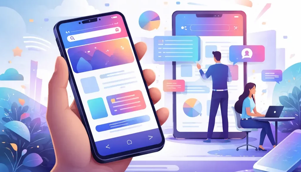
 He Web design for mobile is no longer a trend or a secondary strategic option: it is the core of any digital project in 2026. The way in which users consume information, buy products or interact with brands has changed radically in the last decade. Today, the mobile phone is the first point of contact between a company and its audience, and that forces us to rethink from the ground up how a website is conceived.
For years there was talk of “adapting” the web to mobile. That approach has become obsolete. It is now designed directly for small screens, prioritizing the mobile experience from the beginning of the project. This change in mentality is not only technical, but also strategic. It involves understanding the context in which the user navigates: displacements, constant interruptions, variable connections and a need for almost absolute immediacy.
Table of Contents
Mobile-first: more than a methodology
Mobile web design in 2026 is built on the premise of intelligent simplicity. It is not about simply eliminating content, but rather prioritizing it so that each element has a clear purpose. Users don't read, they scan. They don't wait, they abandon. Therefore, every second counts and every design decision has a direct impact on conversion.
The mobile-first approach is not just a way of designing, but a way of thinking about digital business. It forces us to prioritize what is essential, to clearly define the objectives of each page and to build experiences that respond to real user needs.
Speed, performance and positioning
One of the fundamental pillars is the loading speed. In an environment where 5G coexists with unstable networks, performance continues to be decisive. A heavy website, with unnecessary or poorly optimized resources, penalizes both the user experience and search engine positioning.
Google has been prioritizing mobile indexing for years, and in 2026 this priority is absolute. A website that does not work flawlessly on mobile simply loses visibility. Design and development must go hand in hand to ensure minimal loading times and a smooth experience.
Do you want an optimized and functional web design?
Briefly explain your business and your needs. We will find your solution.
Intuitive user experience and navigation
Usability has evolved significantly. Large buttons or simplified menus are no longer enough. The design must anticipate user behavior. Touch gestures, scroll navigation, interaction with dynamic elements or integration with device functions are part of the current ecosystem.
Designing for mobile phones involves thinking about fluid, almost invisible experiences, where the user does not have to stop to understand how the website works. Everything must be natural, immediate and coherent.
Visual design and emotional connection
On small screens, each visual element takes on greater prominence. Fonts, colors, microinteractions and animations must work together to generate a feeling consistent with the brand identity.
Aesthetics are no longer just a matter of style, but of perception and confidence. A well-designed website conveys professionalism in a matter of seconds, something key in an environment where the user's attention is extremely limited.
Content adapted to the mobile environment
The content is also transformed. Long, dense texts give way to more dynamic structures, where the reading pace adapts to the mobile user. This does not mean simplifying the message, but rather making it more accessible.
The narrative is still important, but it must be built thinking in fragments, in blocks that can be consumed quickly without losing depth or informative value.
Artificial intelligence applied to web design
In this context, artificial intelligence has begun to play a decisive role. From automatic layout generation to real-time experience personalization, AI-powered tools are redefining the web creation process. For those seeking to understand this new scenario, it is especially interesting to explore this resource on how to make a website with artificial intelligence, where the current possibilities of this technology applied to design are analyzed.
SEO and experience metrics
The mobile-first approach also directly affects positioning. It's no longer just about keywords or links, but about experience metrics. The dwell time, the bounce rate or the user interaction are conditioned by the quality of the mobile design.
An intuitive, fast and attractive website retains the user. A confusing or slow website kicks you out in seconds. Design thus becomes a key factor in any SEO strategy.
Adaptability and new devices
Mobile web design must adapt to an increasingly diverse ecosystem of devices. We are not just talking about smartphones, but about tablets, smart watches and even hybrid interfaces.
Design flexibility is essential to ensure a consistent experience across formats. This is where technologies like advanced responsive design and modular design systems come into play.
Accessibility, privacy and trust
Accessibility has gained prominence in recent years. Designing for mobile involves considering all users, including those with visual or motor limitations. Aspects such as color contrast, text size or voice navigation are now essential.
At the same time, security and privacy have become key factors. Users demand transparency in the use of their data, and the design must integrate these elements clearly, without generating friction.
Resources and continuous learning
Web design is a discipline in constant evolution. Staying updated is essential to offer effective and competitive solutions. There are specialized platforms that analyze trends and good practices, such as Smashing Magazine, an international reference in design and user experience. Continuous training and the ability to adapt are, today more than ever, differentiating elements in any professional or company in the digital sector.